MAIN CONCEPT
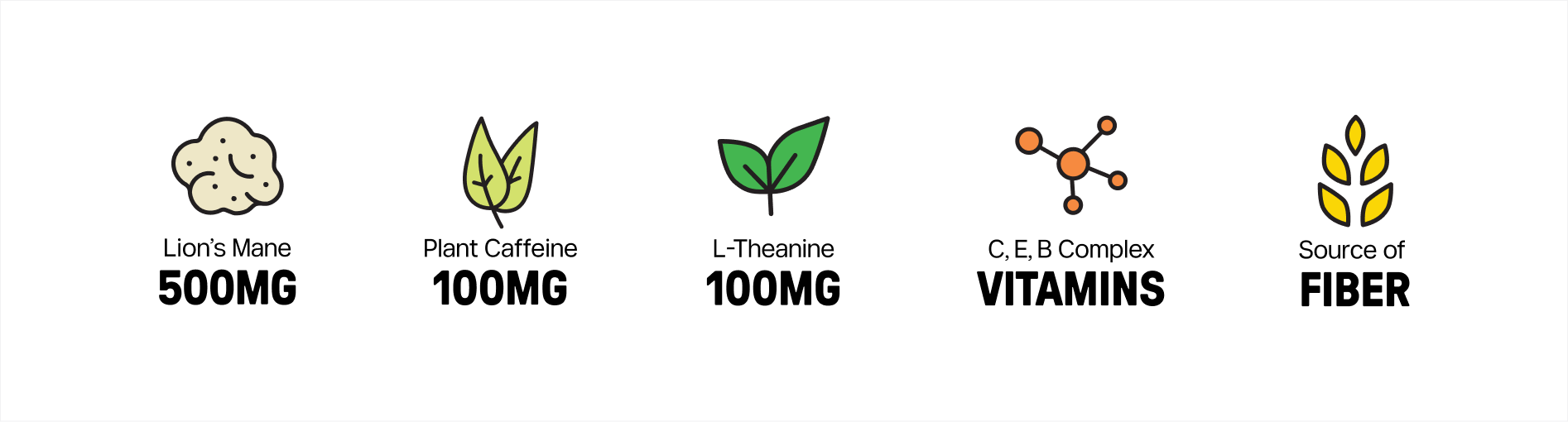
Sody is a functional soda built as an alternative to the afternoon coffee, combining Lion’s Mane, plant caffeine and L-theanine with real fruit and no added sugar.
The category tends to look either clinical or aggressively sporty. Sody was positioned away from both, closer to the things its audience already keeps on the desk, with the function printed rather than implied.
A white cat carries the rest. Inspired by the cat that lives at the factory where Sody is produced, the mascot stands for flow rather than energy, and gives the brand a character that holds across packaging, digital and campaign work.
PACKAGING
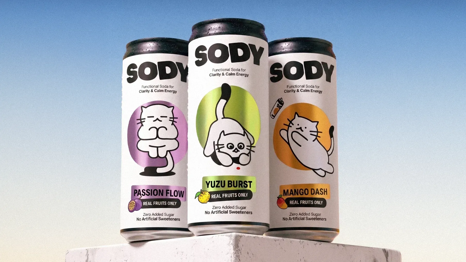
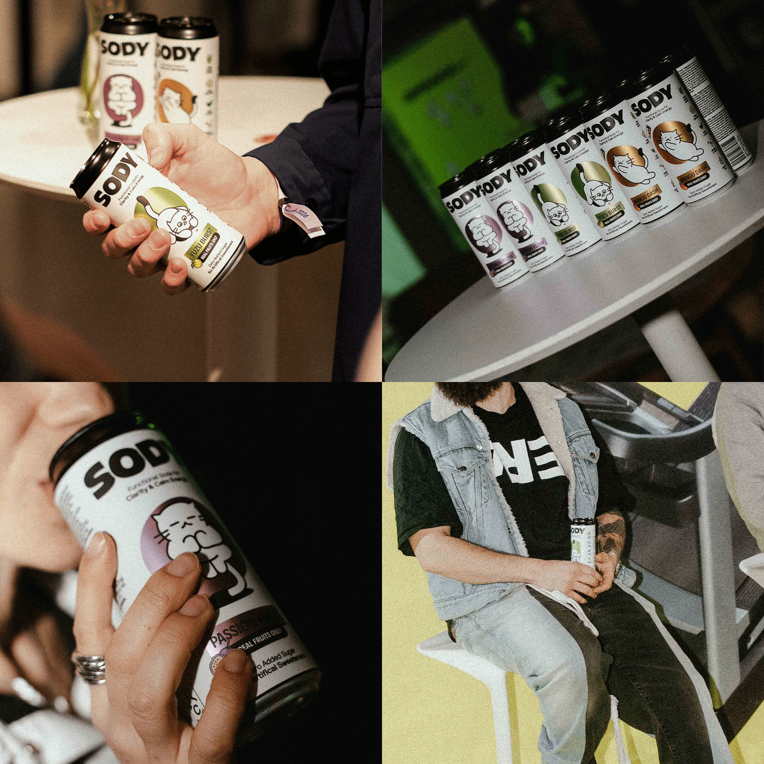
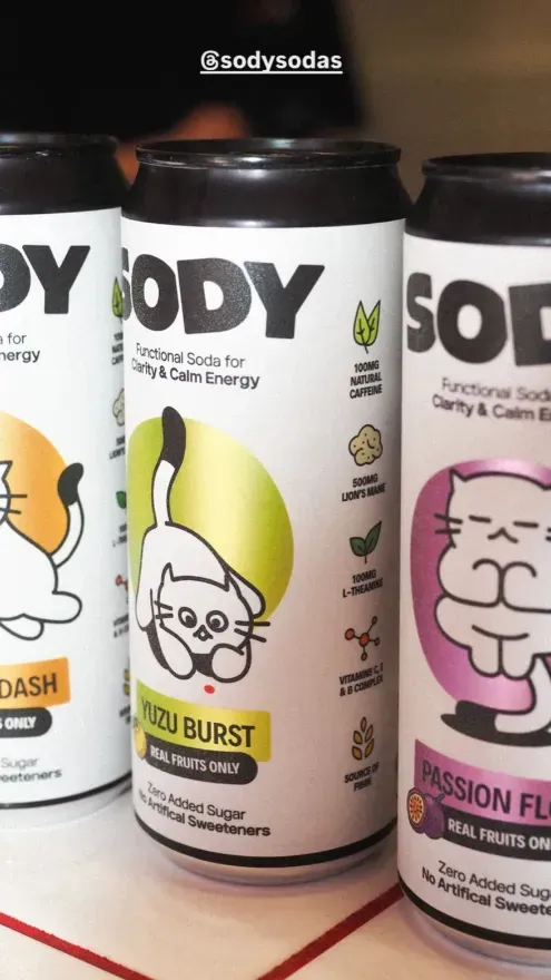
The can pairs a clean, textured body with a metallic, flavor-coded bubble and a distinctly posed mascot over it. This contrast gives the pack a tactile, premium quality while keeping flavors recognizable at a glance. Since Sody contains no added sugar or artificial sweeteners, the natural sweetness indicator on every can sets the expectation before the first sip.
THE BOX
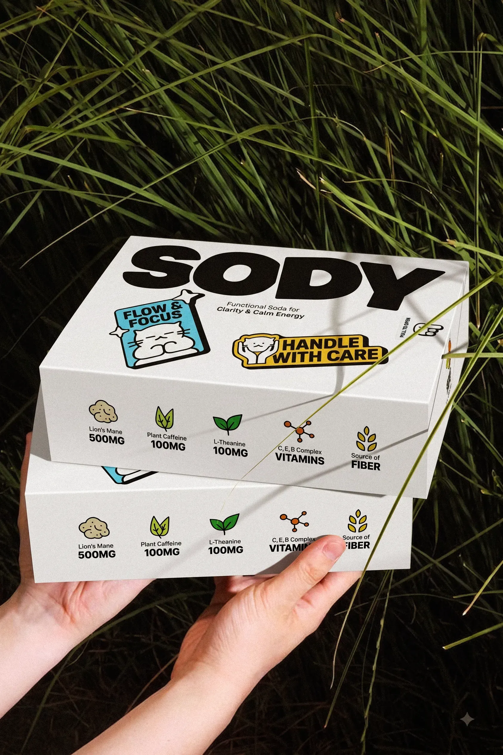
We extended the same visual system across the boxes used for online orders, carrying Sody’s personality from the shelf to the unboxing experience.
WEBSITE
The Sody website was designed as a direct extension of the brand: minimal and considered, with enough playful detail to keep things from feeling too polished. The Sody mascot, flavor colors and deadpan copy bring personality to the experience, while bold typography and generous space keep the system calm and easy to navigate.
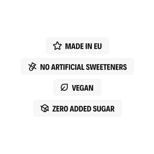
Product benefits, ingredients and flavors are presented with clarity, leading into a straightforward shopping flow that makes discovering and buying Sody feel effortless.
USER GENERATED CONTENT
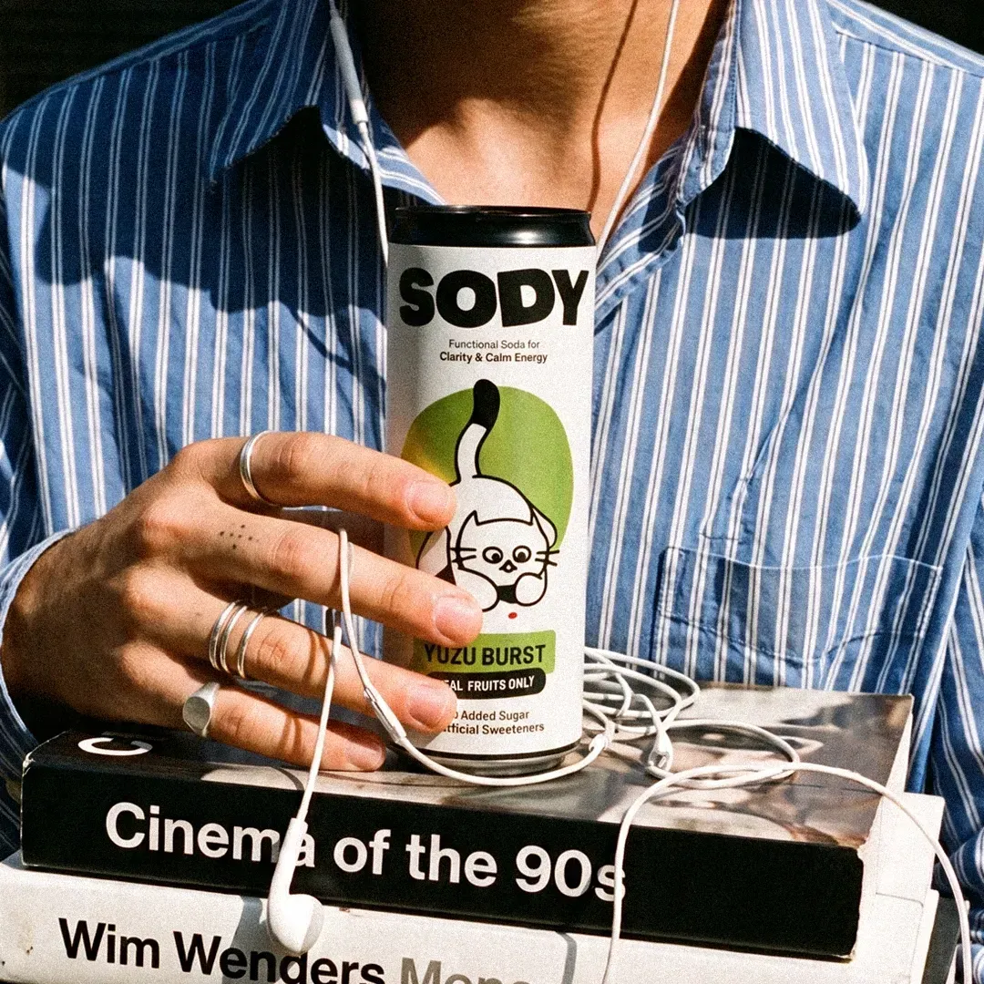
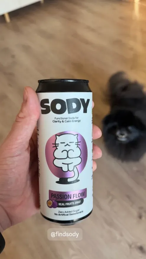
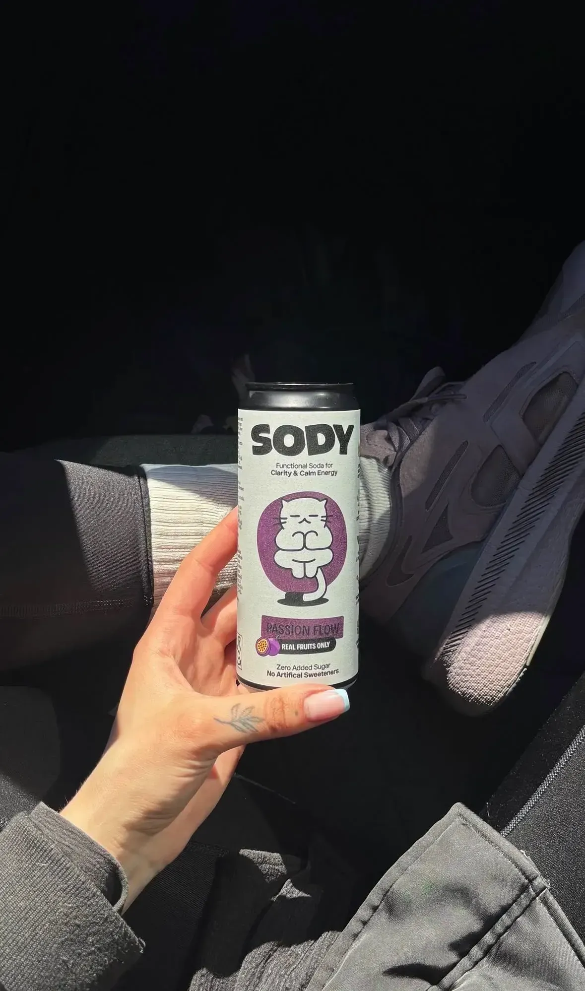
Sody quickly began living beyond our own channels. Customers shared footage, stories and Instagram posts showing the cans in studios, offices and everyday moments. This user-generated content became an important part of the brand - adding real voices, unexpected perspectives and a sense of community to Sody’s carefully designed world.
NEXT PROJECT