MAIN CONCEPT
IVYH makes hydration powders for purposeful, everyday living. We created a brand identity rooted in sleek Scandinavian minimalism, bringing together clean design, natural wellbeing and a clear commitment to quality.
A deep forest green grounds the brand in nature while giving it a calm, premium presence. Subtle slits cut through the typography and icons, suggesting flow and retaining only what matters. The resulting system feels modern and considered, extending cohesively across packaging, merchandise and the wider brand identity.

PACKAGING
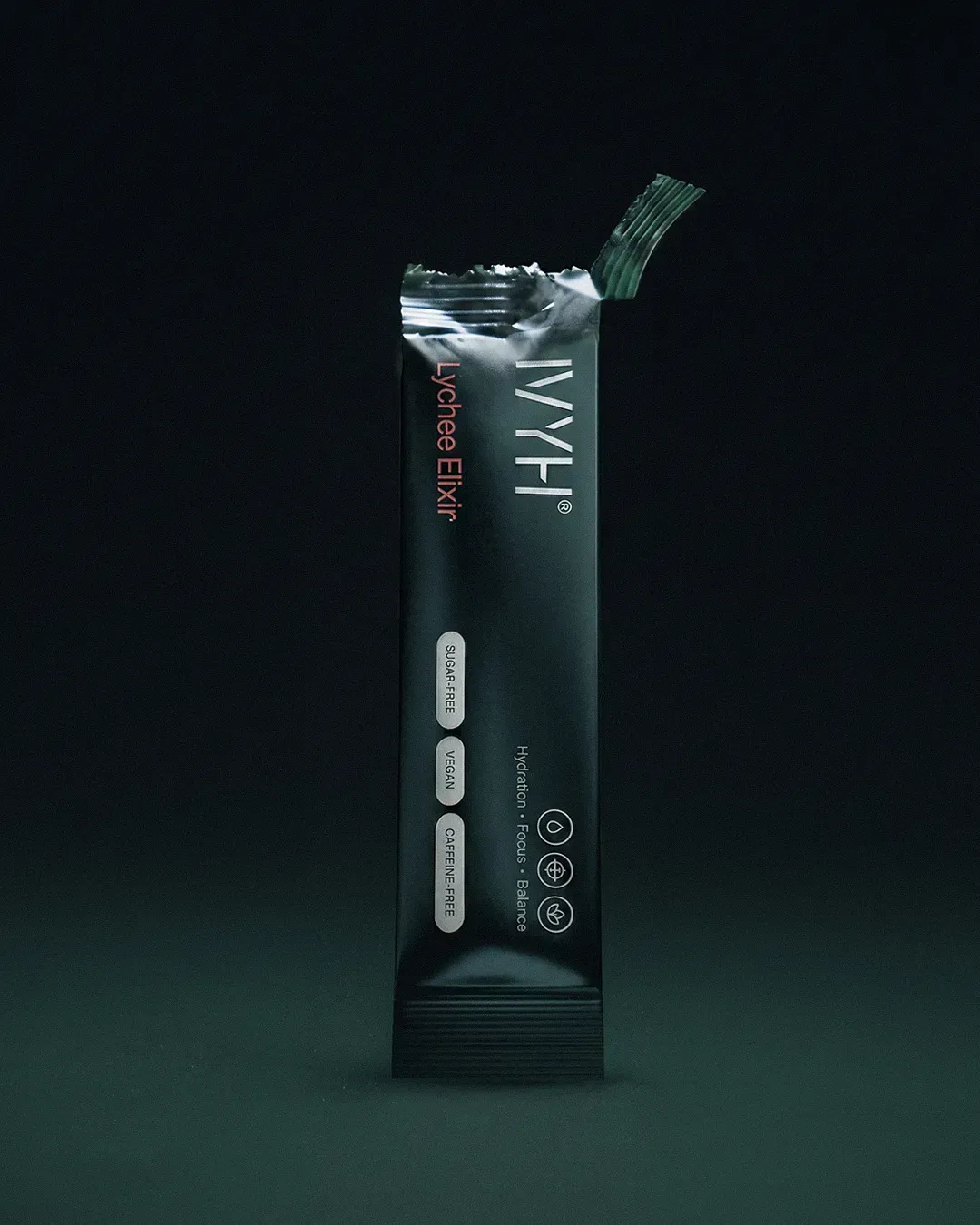
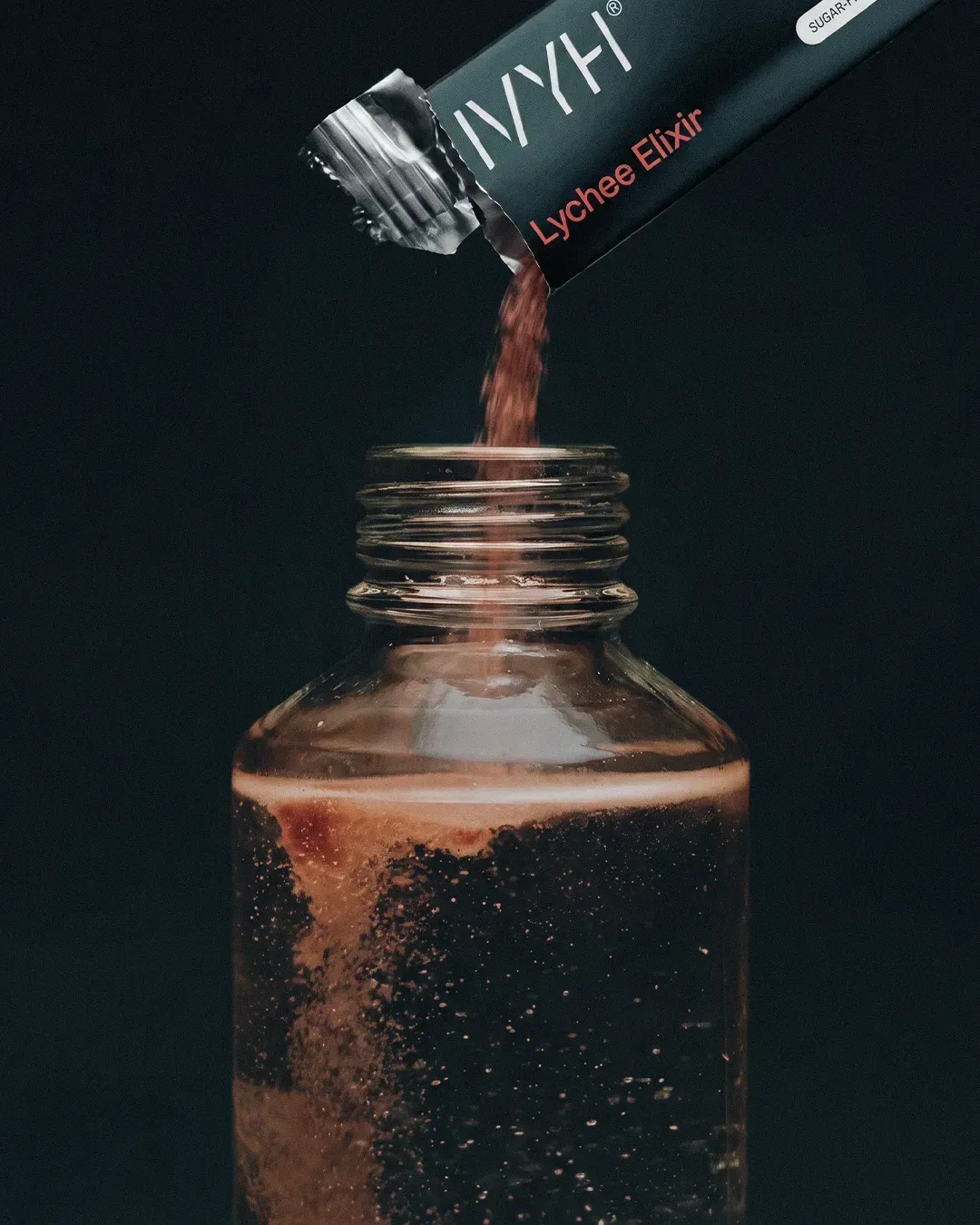
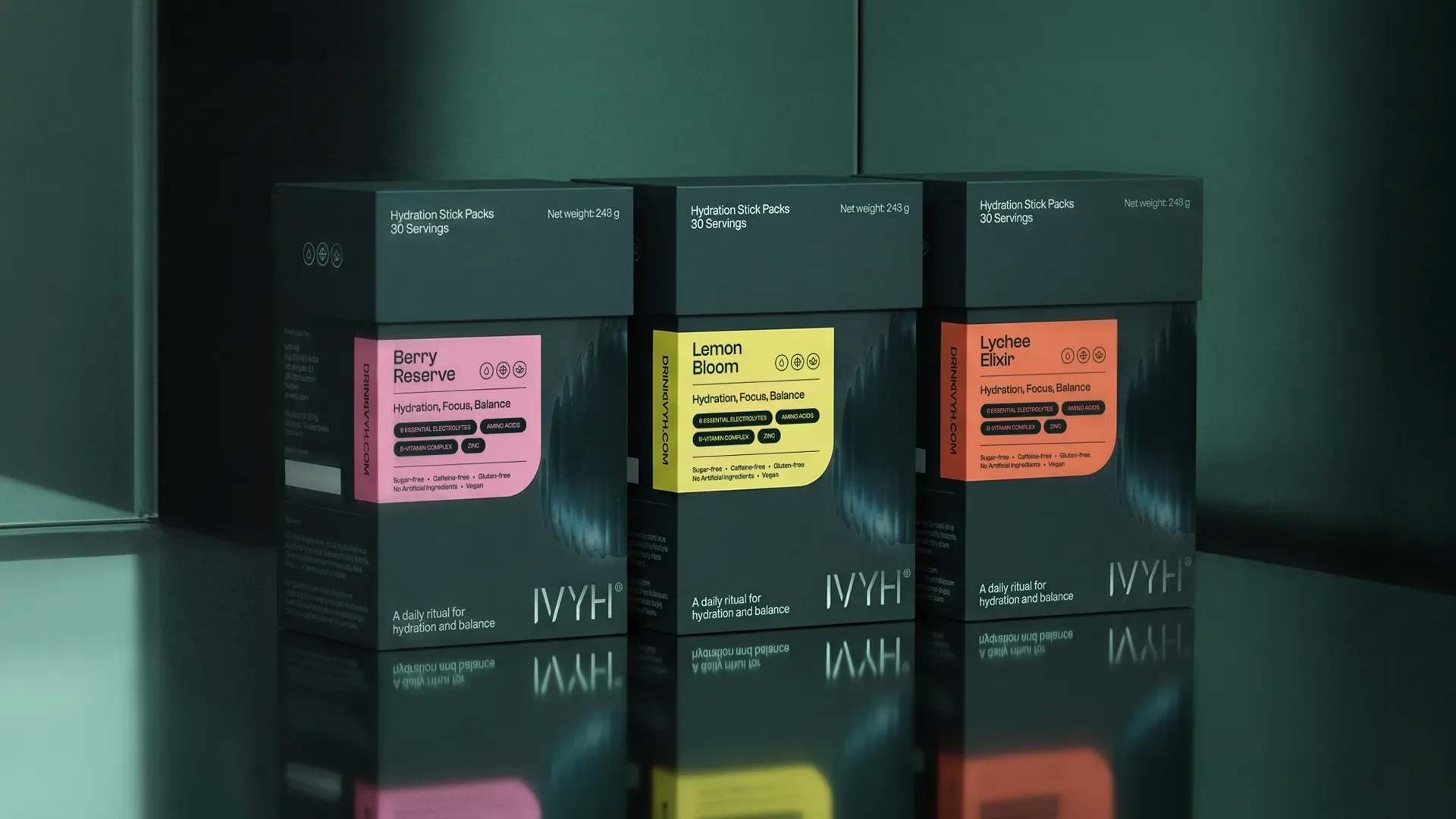
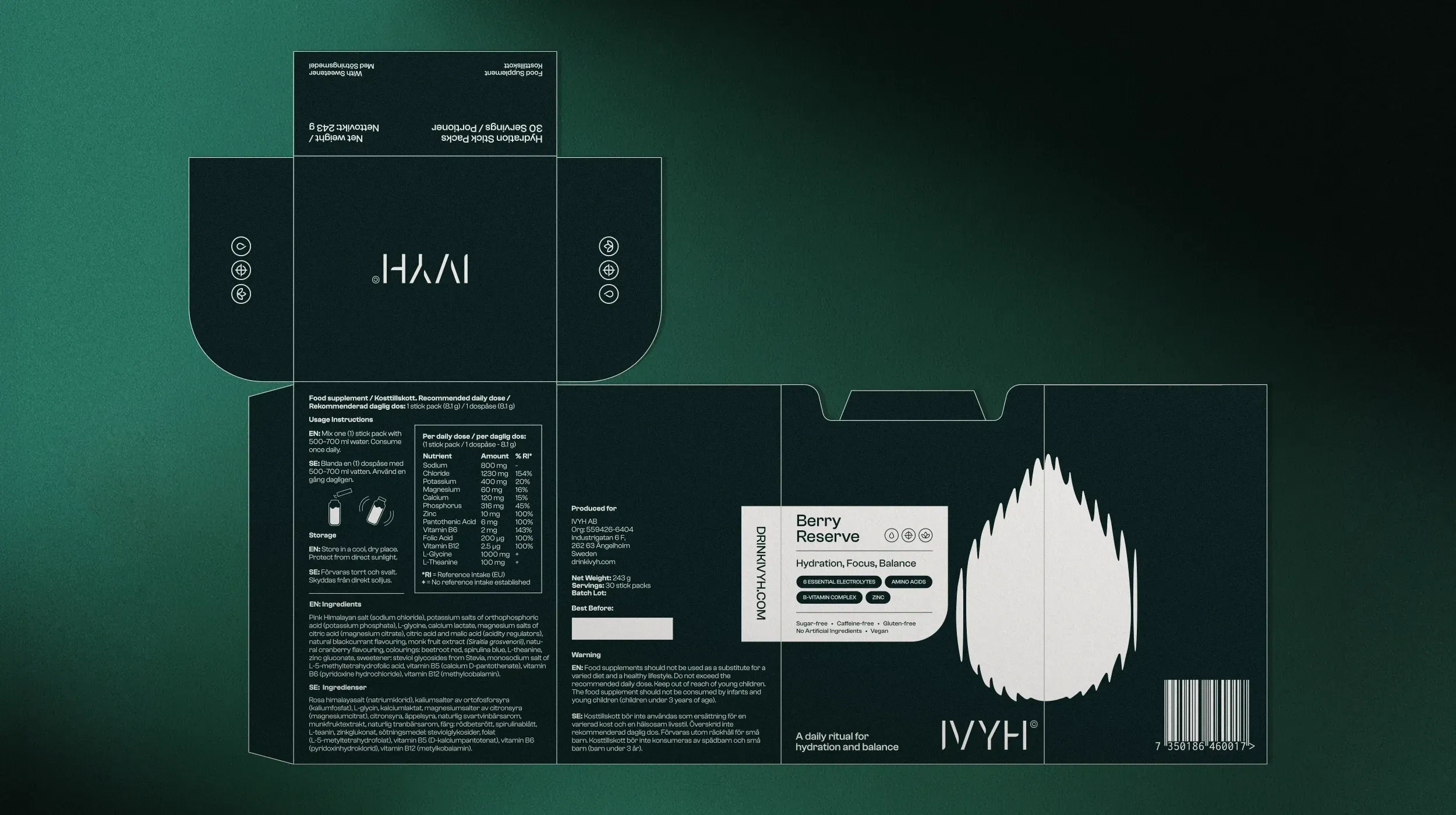
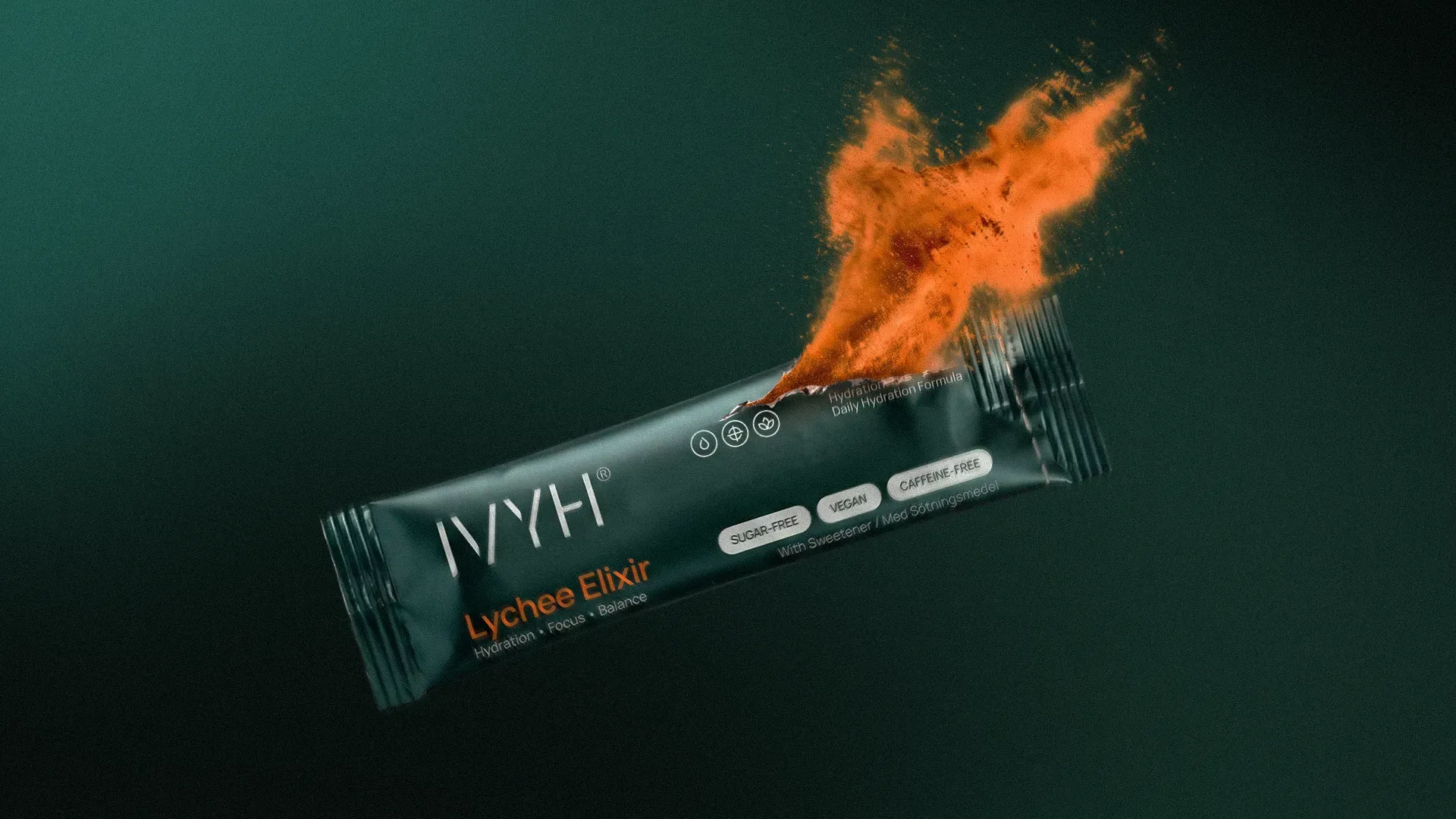
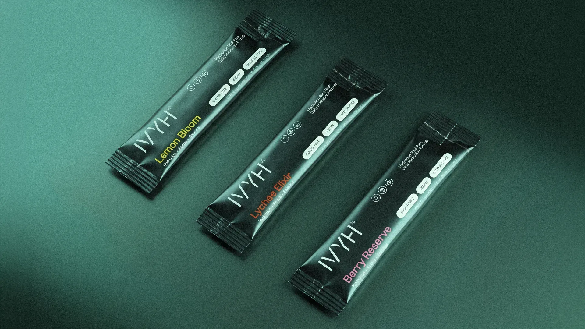
The packaging system spans individual powder sachets and a tactile presentation box. Carefully selected textured materials give the box a premium feel, while a die-cut rippled droplet finished in high gloss creates a distinctive focal point. Each flavor is expressed through its own color, bringing variety to the range while the restrained layout keeps the collection minimal and cohesive.
VISUAL IDENTITY
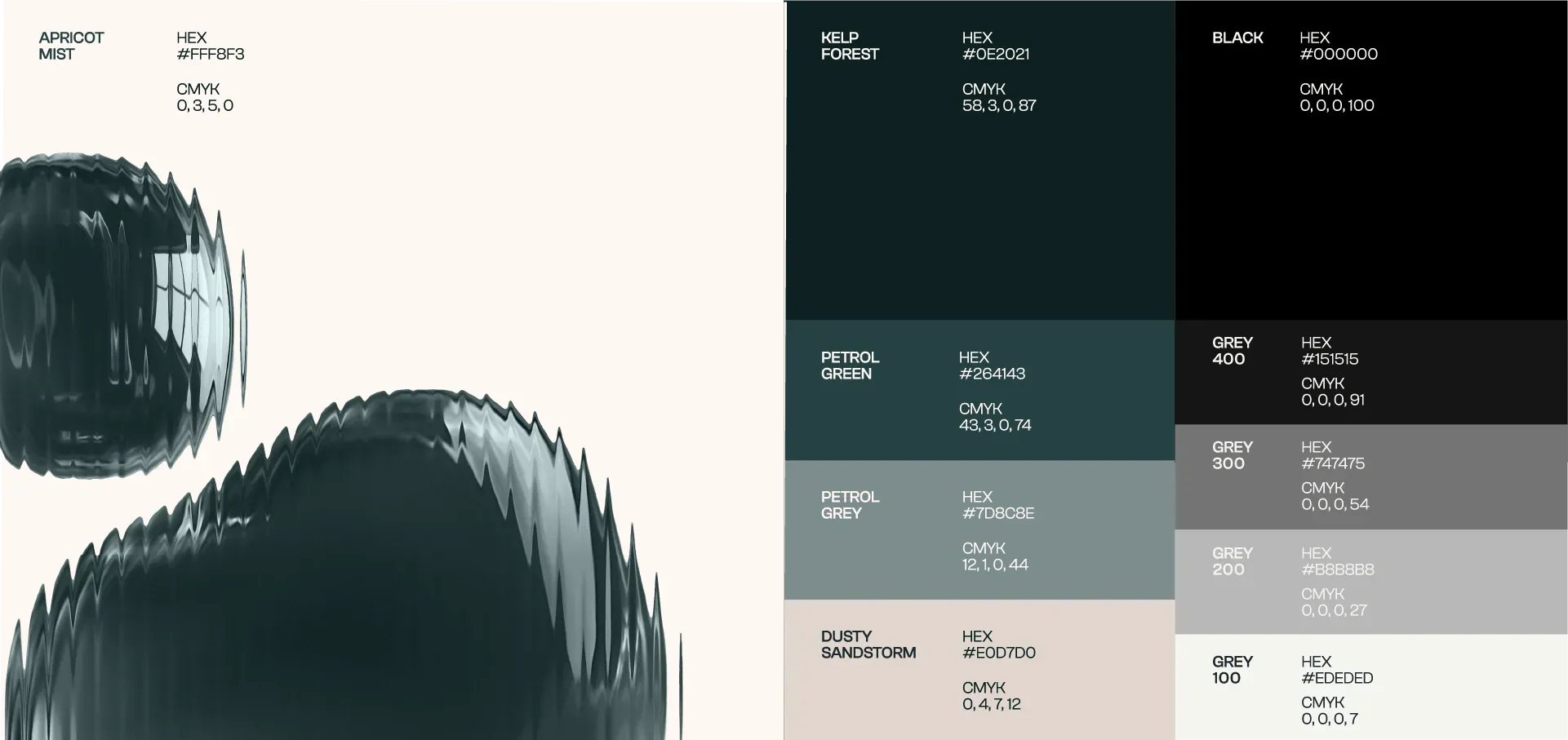
The identity is built to hold scientific credibility alongside everyday warmth. Clash Grotesk sets a clean, unadorned tone across the system, while a palette anchored in Kelp Forest and lifted by soft neutrals keeps the range calm wherever it appears. A set of line icons moves between the ingredients and the function, each cut by the same slit, so the science stays legible without the brand ever feeling clinical.
MERCHANDISE
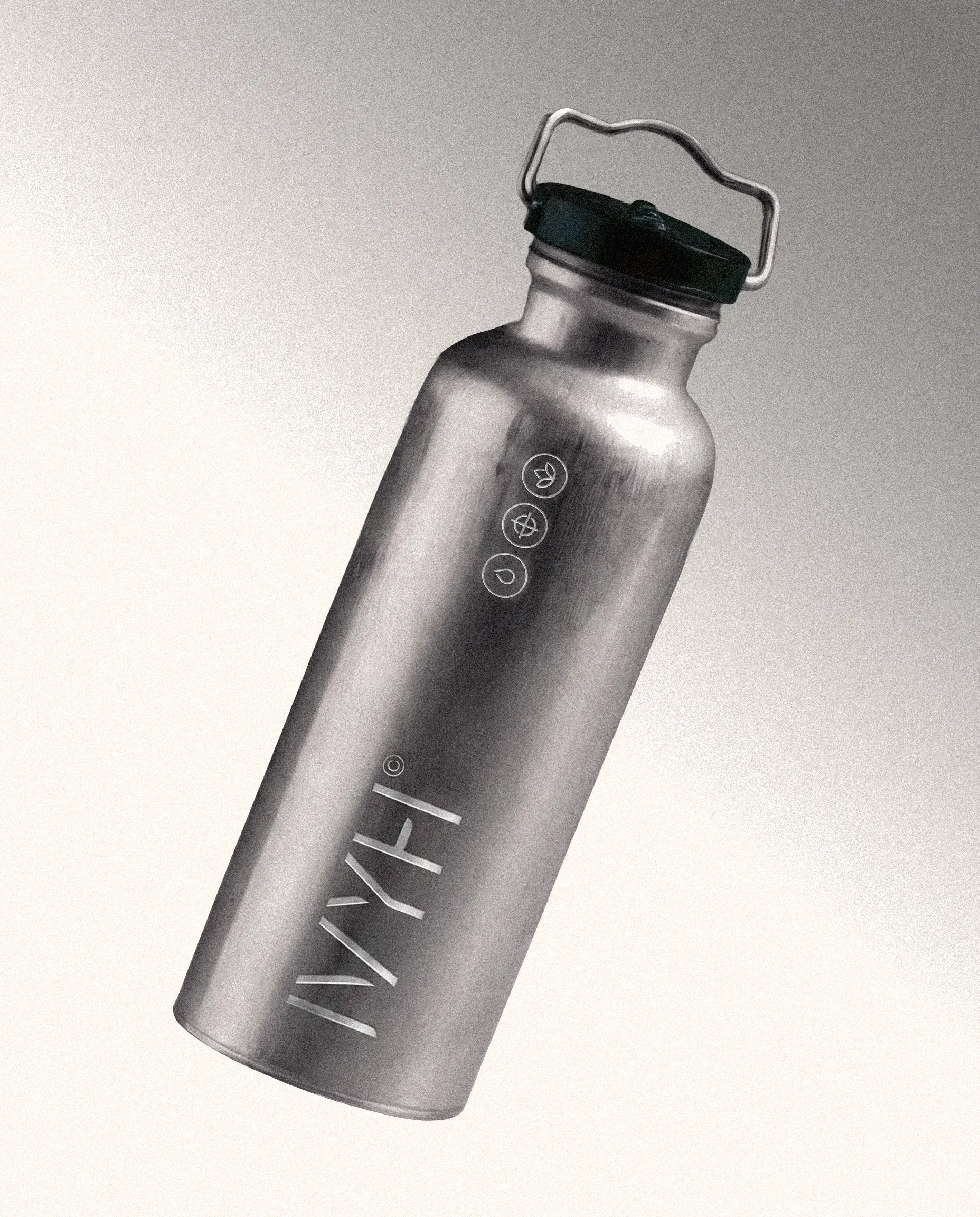
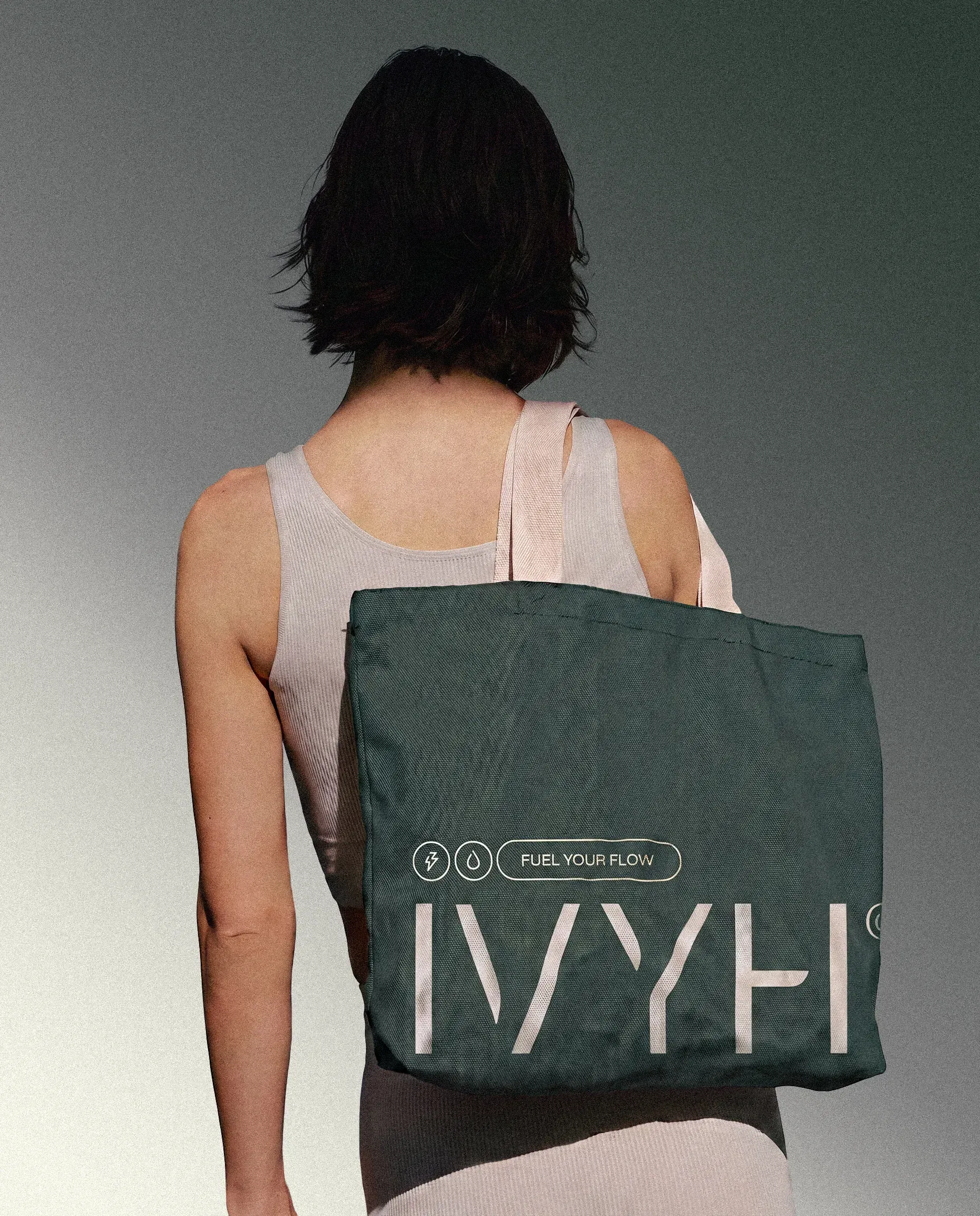
The accompanying merchandise carries IVYH’s minimal, contemporary character into everyday life. From reusable water bottles to wearable pieces, each item extends the identity beyond the packaging and turns the brand into part of the daily hydration ritual.
NEXT PROJECT